Around 86% of people fill out at least one web form a week. Though, not each user actually completes it. One of the reasons is poor design of the web forms. This results in a lot of missed opportunities for companies, the most crucial being lost revenue and a worsening relationship with clients.
Most people don’t mind completing the forms when they are understandable, uncluttered, and well-designed. And that is the problem — many online forms are too long, confusing, or even aggressive (and some of them may have all these disadvantages at once). When a form puzzles a user or asks more than necessary, there is a risk the user will refuse to complete it.
That’s why we are going to talk about how to design web forms that people will be able to complete quickly and without confusion. Though I admit there is no unified solution for each case, the following design guidelines could do wonders for user experience and conversion!
Here are the top 7 UI tips from MindK, a web design and development company.
Tip 1: Follow logic when organizing the form
The first aspect we are going to focus on is the structure of the form layout. The web form is a kind of conversation and should involve logical communication between the user and the interface. For instance, it’s uncommon to ask for an address before the user’s name. Here is what you can do to improve web form UX:
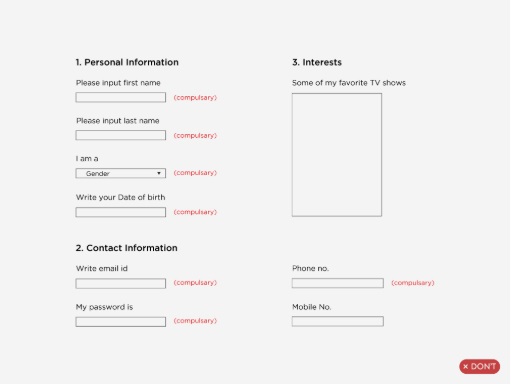
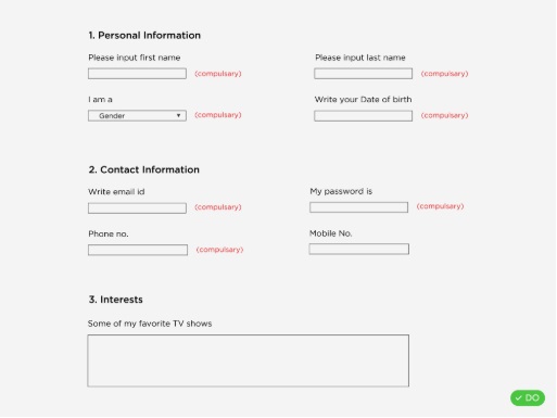
- Combine related fields into sections. The information grouped into blocks is able to evoke associations. When there are more than six fields in the form, group them into logical sections. Or better yet, give each of the sections a corresponding header. Clearly, all the fields have to follow a logical order. When grouping fields into sections, leave enough breathing space (padding/ distance) between them.
- Avoid multiple columns. To not disperse user attention, try to display fields below each other in one column. However, short or logically contiguous fields like phone numbers, city, state, or area codes can be located in line. If creating one column is impossible, build groups of fields and place them in top-down order.
 Source: uxdesign.cc
- Ask only what is required to minimize the number of fields. Try to ask the minimum, thus users will complete the form quickly. Each additional field means a number of users who decide to skip the form. Imagine that Expedia has saved around $12 Million simply by deleting one field on their web form.
- Apply a multi-step form when it is too long. Multi-step form means dividing your fields into a few shorter forms, placed on a separate web page. This option may be perceived more manageable for the user. In this case, the short first step of the form usually gives the impression the form is small. Add the progress bar and place sensitive information fields in the final step. It will motivate the user to complete the form.
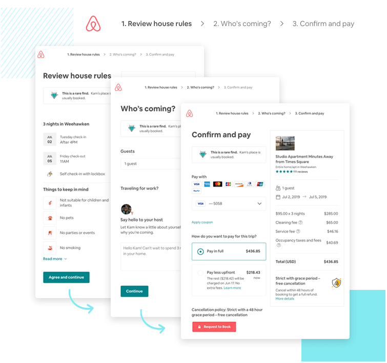 Source: airbnb.com
Tip 2: Make labels know their place
Positioning of labels is likely the most popular topic when the talk turns to the form UI design. No wonder, as there is a range of various options available. Although, all designers agree that the best option is having labels always visible, and located above or beside the field.
Clear labels is one of the best ways to make a web form UI design more accessible. They tell users the purpose of the field, preserve usefulness and remain visible even after the field is completed.
Try to place labels text to allow efficient and effective scanning and minimize errors or missed fields. Based on the experience of making design for different web interfaces, I tend toward the following options:
- top aligned labels. As a rule top aligned labeled forms are better completed compared to left aligned labels. Top aligned labels also work well for mobile forms.
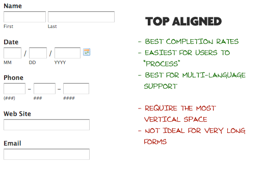 Source: css-tricks.com
- left aligned labels. However, left aligned labels are considered for entering large data sets with variable optionality, they are always easier to scan, they reduce height and allow users to compare answers to the labels with only one glance. Pay attention that they work well for desktop views only.
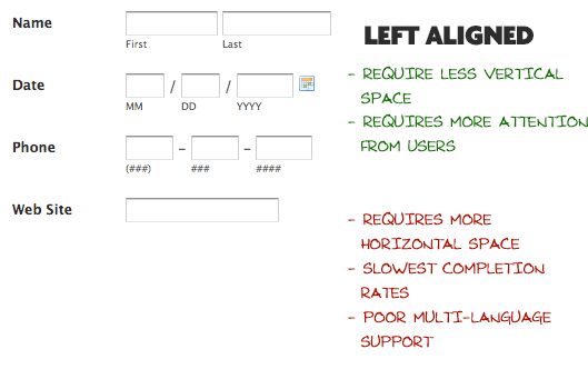 Source: css-tricks.com
- floating labels. Another option of label positioning that works really great for mobile, saves space, looks really clean and clear, and does not leave usability behind. The idea is simple – when someone types into the input box, the float label in the form of text shows beside the input that prevents the user from losing the context. It is crucial for mobile interfaces, as users see the field they are on, and what they are typing. In fact, it does not work with checkboxes or radio or limited text.
 Source: dribbble.com/mds
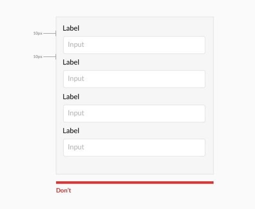
- grouping labels with their input. The spacing between the label and the field usually looks confusing and makes it difficult to understand what to enter.
Presenting labels and inputs close to each other makes them look related and reduces confusion. The principle to place related items closer goes back to the Gestalt psychology, which explored how and why the human brain perceives an object as a whole rather than as a sum of separated parts.
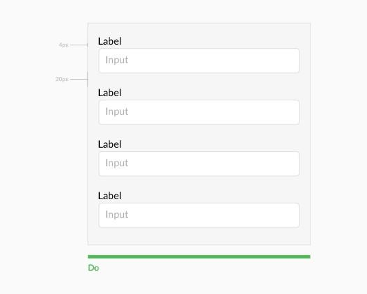
 Source: crazyegg.com
- avoiding all caps and writing clear labels. Using caps is not a good practice in website form designs. Such text is difficult to read and our mind needs more time to absorb it. If the text is written in capital letters, the speed of reading decreases by 13 to 20 percent. Also, all caps labels can make an impression of “shouting” at the users.
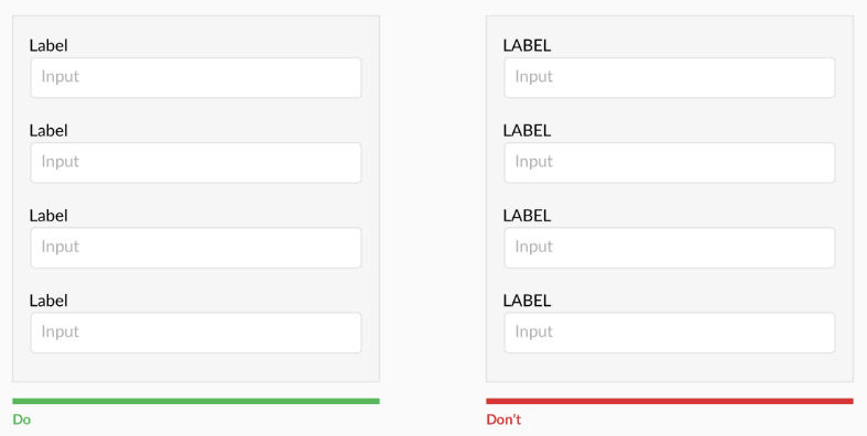 Source: crazyegg.com
Also try to show users what information is required in one glance. Avoid using complete sentences to explain simple questions, just one or two words generally is enough.

Tip 3: Do not ignore input design
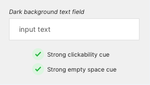
The most important component of web forms to request data from users are text fields. That’s why they need to have strong visual cues that define what the user has to do. Strong visual cues are evaluated according to two main parameters: clickability and empty space.
In other words, the inputs should be empty and clickable. Otherwise more time is needed for users to interact with the fields. It may be several seconds more, but if we talk about completing a big form each second counts.
Let’s review it with some form design examples.
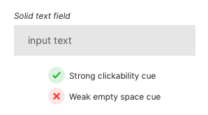
A solid text field filled with gray resembles more a button than an empty input field.
 Source: uxmovement.com
It happens because users couple white spaces together with emptiness. Thus, white space in the text fields shows users that an input is required.
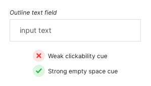
Another example is an outline text field with a strong cue for empty space, but a weak cue for clickability. It has a white space but a weak outline that may cause missing it against the white background.
 Source: uxmovement.com
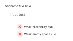
Horizontal line defining the text field is not a good idea as well. It lacks both important visual cues and can be mixed up with a line separator for separating content.
 Source: uxmovement.com
The best way of input design involves dark background and white space filling. The visual clarity of this option allows interaction with the text field quickly and without confusion.
 Source: uxmovement.com
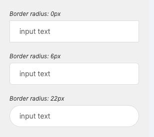
When you are sure that your input fields have strong visual cues, it’s time to think about the form and corners of the text field.
Surprisingly, it was discovered that sharp outlines of visual objects are associated with a sense of threat and cause negative attitudes, while curved outlines are more preferable over sharp ones. In other words, rounded corners of your input field can make it more user-friendly.
 Source: uxmovement.com
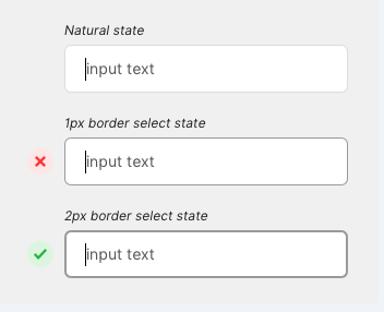
When a text field is selected users need an additional visual cue of the action. The select state shows the users again where he is typing his input and prevents him from mistaking the field with the nearby inputs.
Changing the color of active input is not enough as there is a risk of neglect to color blind users. Changing both a color and shape makes it easier to notice the cue by users and thus, complete tasks faster.
 Source: uxmovement.com
Just look at this input field from Shopify, who uses white text field, dark background, select state border and rounded corners at the same time. That’s perfect!
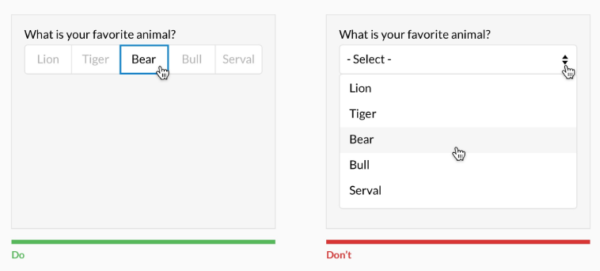
If you deal with multiselect, then it is better to show all the options (only if they are less than 6). A selector drop-down here is not the best choice as it needs at least two clicks, and conceals the options. You can apply for an input selector in the case of more than five options.
 Source: uxdesign.cc
Try to be on the user’s side and foresee the issues he can face filling in the web form. For instance, if the input contains over 25 options, help users select from them. A contextual search within drop-down is an excellent choice within these conditions.
In case you have checkboxes and radios it is better to place them underneath each other for scannability.
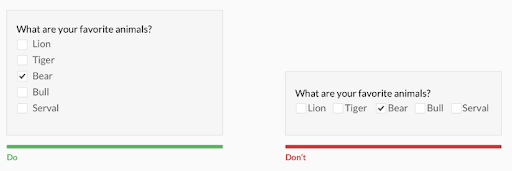 Source: uxdesign.cc
Grow your foresight and help users avoid errors
Humans make mistakes, it is natural. When we speak about interaction with web interfaces, there are two types of user errors: mistakes and slips. Slips happen when a user turns on the autopilot mode and makes wrong actions. The root of the user mistakes, on the contrary, is an incorrect interpretation of what he sees on the screen. And good form design UX is able to prevent such inconsistency of user expectations and the web forms interface. This can be done by:
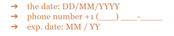
- Making use of marks and hints. When designing web forms try to be as explicit as possible. For this purpose use short help messages, like password setting guidelines or similar. It’s better to use masks instead of placeholders or any hints. For instance:
- Avoiding placeholders (for important information).
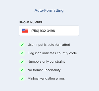
When you deal with phone field formatting it is better to use auto-formatting including country selector and input masking. Unlike placeholders, that are more a static text, masks can format the data provided by the user automatically.
 Source: uxmovement.com
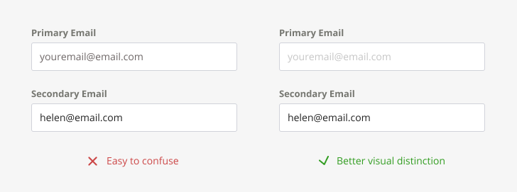
- Making sure you don’t confuse users if you use placeholders after all. There should be a visual distinction between placeholder text and the text filled in by users, as the same style may cause ignoring of the entry field.
- Controlling the field length. The field length hints at the answer length. Use it for fields with a defined character count such as phone numbers, zip codes, etc.
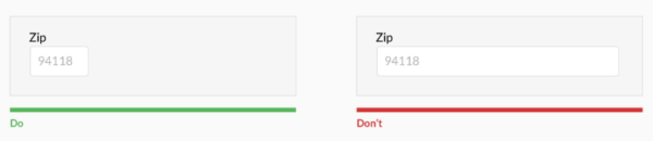 Source: uxdesign.cc
- Marking required vs optional fields. It is not always clear for users what is meant by the field marker *. Instead, mark optional fields. And in cases where most of the fields are optional, use (*) for required fields.
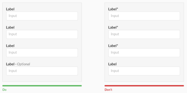 Source: uxdesign.cc
- Preventing mistakes in passwords. A great design of the form should streamline the password process and make it quick, efficient and as error-proof as possible.For this purpose, apply show password option which allows the user to double-check the input. Showing password requirements before filling in the field is a great choice, as well as notifying about pressed caps lock button or language used.
Validation is essential
Web form validation is focused on ensuring that the user has filled in all the information in a proper format needed to successfully complete it. Simply put, it should avoid confusion. A good validation message should state:
- which error happened. You should clearly inform the user (better using red color) that there is an error in the form.
- where the error is. Define those fields where the error has occurred.
- how to fix the error. Inform users what should be done to pass the validation.
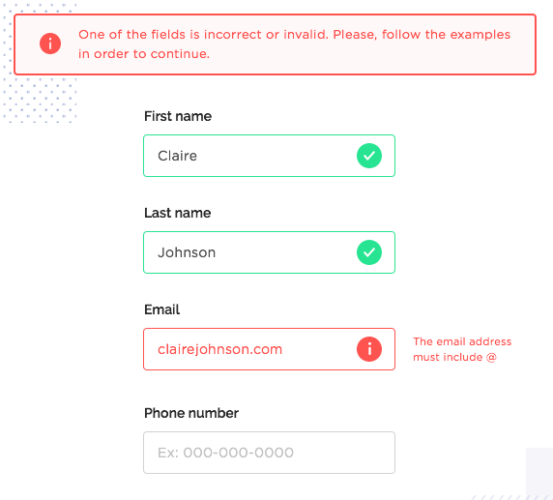 Source: justinmind.com
A great option is to apply inline validation after the user fills out the field. It checks the validity of the user’s inputs live during the progresses through the form. You can use live validation when the user types, when the user pauses, when he reaches the character requirements etc.
It is stated that live inline validation in forms shows incredible results, namely:
- 42% decrease in completion times,
- 22% increase in success rates,
- 22% decrease in errors made, and
- 31% increase in satisfaction rating.
All these shows that inline validation is undeniably productive and able to improve your form conversion.
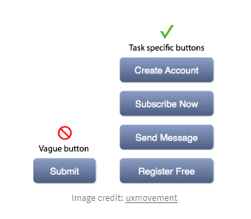
Buttons matter, remember that
Buttons may be considered an unremarkable feature of web forms, however, they can drastically influence the form UX. If you have not thought yet how the buttons look like on your web forms, then it is time to give it a thought.
Here are a few recommendations:
- Define primary and secondary buttons and design them accordingly.
- Think about the button text. Ideally, the button text should finish the sentence ‘I want to…’ or specify what should happen next.
- Give users visual feedback. Let’s, for instance, take a ‘submit’ button. It is better it clearly indicates that the form has been completed. It provides feedback to the user and helps to avoid double posts.
- Make sure calls to actions are highly contrasted. As a rule it is the contrast that matters, not actually the color.
- Show next-step-button only after the form is filled out. This trick works well when paired with inline validation. It helps to keep the user focused on the inputs and prevents from skipping something important.
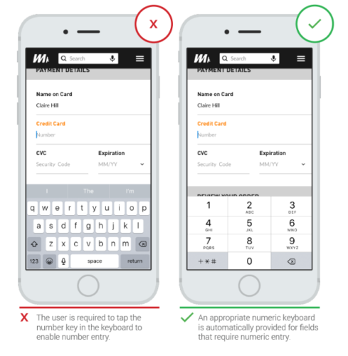
Optimize for mobile
Today, about 70% of internet users access web resources from mobile devices. That is why it is the factor that cannot be overlooked. Good mobile form design creates positive user experience. In turn, it ensures a happy web app visitor who will more likely convert into a client or returning user.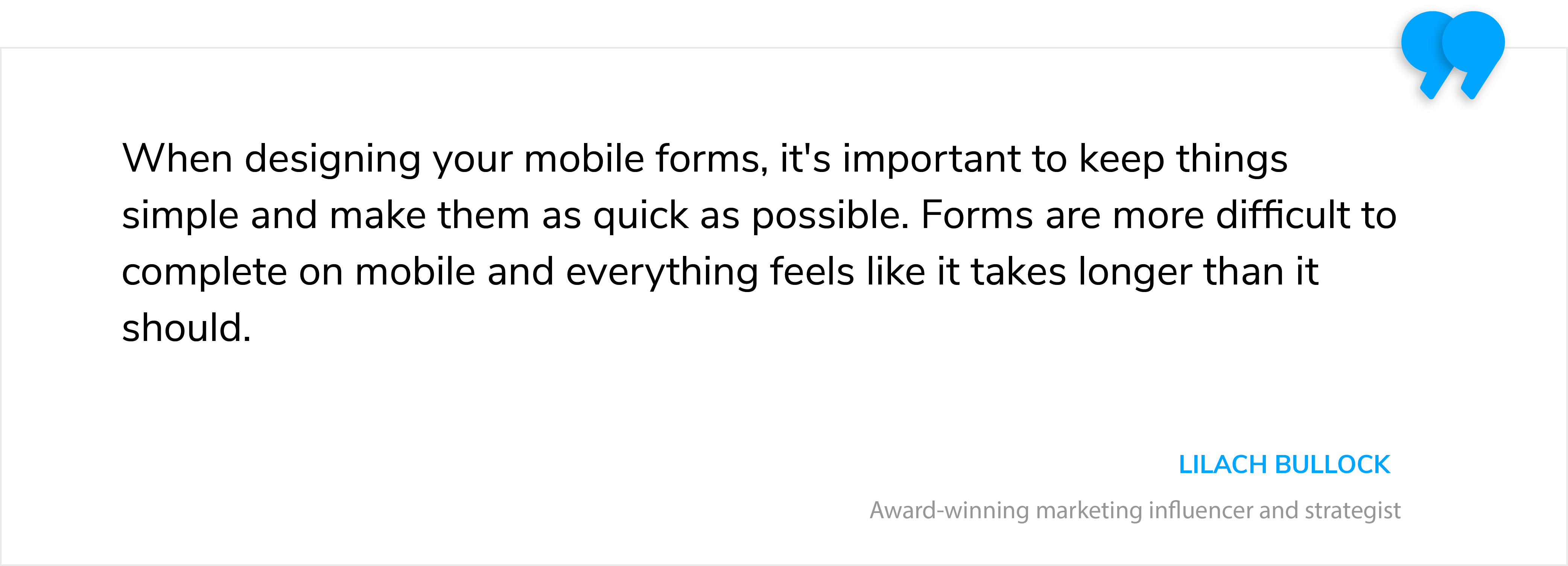
Here is what you can do to optimize your web form for mobile:
- Make sure fields and buttons are at least 48 pixels high
- Take care that all form labels and placeholder fonts are above 16px
- Make maximum use of the native features of mobile devices to simplify tasks (like camera, geolocation, date picker)
- Use certain HTML input types to display the correct keypad
 Source: thinkwithgoogle.com
Conclusion
If you have recognized that web forms in your app are not user-friendly enough now and you observe a decrease in traffic, it’s a sign you should analyze your website UX. I hope these tips will give you some form design inspiration and help make your web forms easy and attractive, as well as convert users into happy clients.
Even the slightest changes may be game-changing. If you need help with designing or redesigning your web application, I am always open for cooperation and new challenges. Just drop us a line!