
Data has zero value if you can’t easily visualize and manipulate it. As a lead UX/UX designer at a custom software development company, I’ve seen firsthand how bad design prevent users from making informed decisions. Here’s the process I typically use to fix this issue with some creative data table design.
In 99% of cases, when people work with data, they need:
- Understand the whole set of information or a part of it.
- Compare different data parts and draw conclusions.
- Find required data units and to explore them further.
- Extract interesting data points from a wealth of information.

Just putting data into a table doesn’t help with any of these tasks. The success of any system working with a large amount of data, combines the advanced collection of data and comprehensive representation focused on user experience (UX).
Working as a UI/UX designer on a number of projects with different web systems, I can confirm that a data table is the best possible solution when it is necessary to represent information simple and functionally.
How to improve data table UI
Let’s start with the example of the table transformation made by Darkhorse Analytics that costs a thousand words.
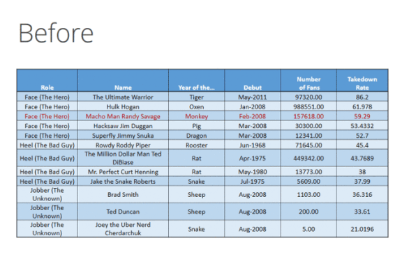
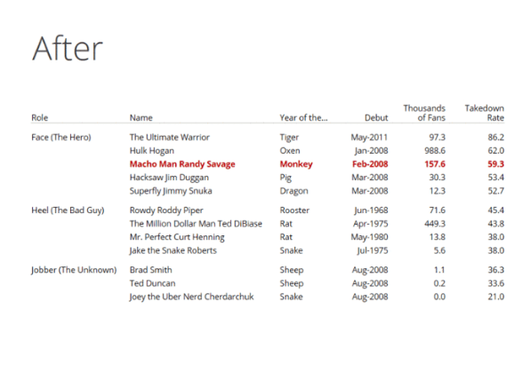 If you liked the result, let’s dive into the details of this transformation.
#1 Don’t stretch tables
The main idea here is – size the columns of the tables according to the data contained in them. Don’t stretch tables to fill the column or don’t set tables full-width. It will be harder to read as the data is unnecessarily separated.
#2 Focus on the text
Avoid borders or frames surrounding the table, zebra striping, tints and fills, and any other backgrounds. By using alignment, spacing, and grouping, you can achieve a human-readable table. As for background, use it only when it makes sense.
#3 Use rules only when absolutely necessary
The lines between rows and columns are typographically called rules. Try to cut down their usage.
Vertical rules are only useful when there is little space between columns that may cause mistakes when reading. When tables have no vertical rules it looks much better. Nevertheless, if using rules is reasonable in your situation, then opt for thin ones.
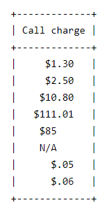
#4 Text – left, numbers – right
Try to align text left, don’t center or justify it. As for numbers, aligning right helps users compare magnitude effectively.
When working with numbers that are rounded to the same number but look different (see the picture below), aligning a column of numbers right won’t help you to effectively scan down the column. But you can align numbers to the decimal point in order to make the column easier to work with.
 Source: alistapart.com
If you work with more complex tables, you can use aligning to the decimal point, ‘×’ or ‘:’
Source: alistapart.com
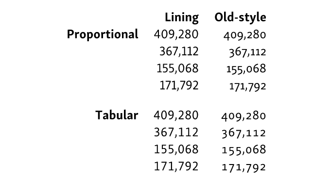
Some tables, like financial timetables, contain mostly numbers. They are aimed to provide the reader with numeric information by means of either columns or rows. In this case, try to line them up vertically so that all digits occupy the same width.
For this purpose, you can use monospaced fonts or proportionally spaced fonts that go with additional sets of monospaced figures called tabular numerals. They are available in old-style and lining variations and have equal width.
Here’s an example of different numeral styles compared:
Source: alistapart.com
#5 Group and separate using white space
It is better to set the data apart from each other so that its elements can be read and identified individually. Move related data closer together to be distinct from other data. Make sure that similar information looks similar at first glance by using alignment, color and font style for this purpose.
#6 Remove repeated content
Content that is repeated in all cells of the column (for example, measure points) can be moved to the column header to avoid visual noise.
Here is a great example of how the table UI design can be improved in the blink of an eye using the tips.
Do you think that’s enough? Not if you work with tables in mobile or web applications. Apart from the tips above, you should brush up the user experience too.
I have prepared a list of powerful methods I use on a daily basis to make table UI pleasant to use.
How to perfect the table UX
Now let’s talk about how to make working with a web table plain and simple with a set of elegant pieces of advice.
You can apply the tips depending on the table you are working with: its size, the number of columns and rows, and the aim of the table. For example, if you work with a table containing only three columns, you likely don’t need the horizontal scroll.
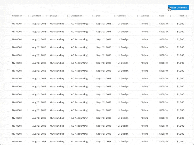
#1 Fix the headers
Fixing the row header is a great tool to help the user understand what column he/she is when scrolling the table that contains a good deal of rows.
#2 Use horizontal scroll
When you deal with web tables and large sets of information, using a horizontal scroll may be the first-aider. You can add the possibility for users to lock certain columns to easily compare data in different columns with various anchoring identifiers.
Source: uxdesign.cc
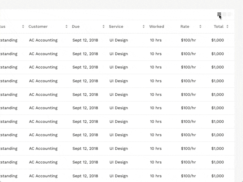
#3 Propose different view options
Compact display density allows the user to view more information without scrolling. Give the user a choice among several view options.
Source: uxdesign.cc
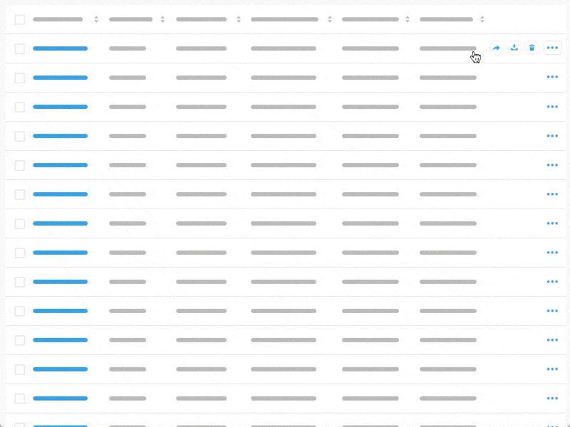
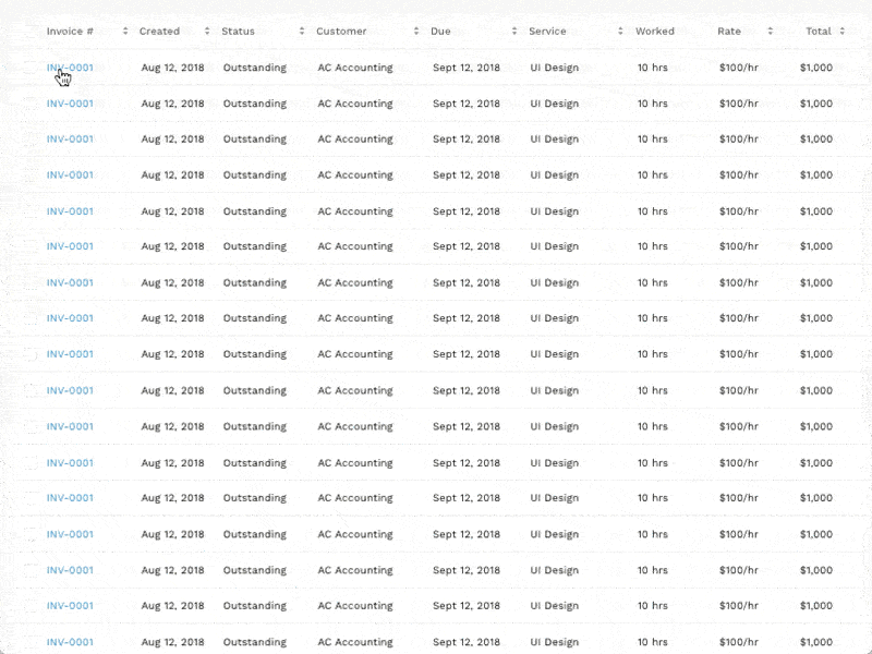
#4 Add hover actions
Hover is a great way to add certain information in the digital tables without an extra column or a row. It helps avoid information overload.
The only drawback of this feature is that the user may not discover hover actions if he/she doesn’t interact with the table.
Source: uxdesign.cc
#5 Use expandable rows
An expandable row is one more way to avoid information overload in the web table design. With the help of expandable rows, a user can review additional information without losing the table context.
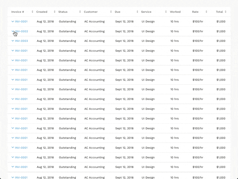
Source: uxdesign.cc
#6 Add a quick view
As you can see there are a number of tools to beat the excess information. A quick view saves space and allows not to lose the context. You can place the quick view pop-up screen in any corner, depending on the table type and customer needs.
Source: uxdesign.cc
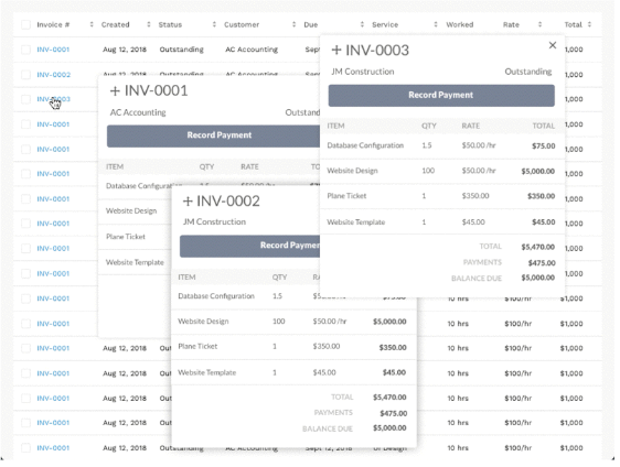
#7 Use modals or multi-modals
These features help users to stay in-context and focus on additional information at the same time. When users need to actively review additional data, compare items or look through various details, the multi-modal feature is a great thing to use.
Source: uxdesign.cc
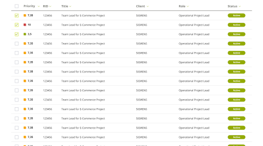
#8 Involve filtering and ordering
Working with large sets of data without an ability to filter it according to required parameters can turn into a nightmare. To secure users against troubles, use basic or advanced filtering.
Basic filtering allows manipulating the data in the table with the help of predefined filters.
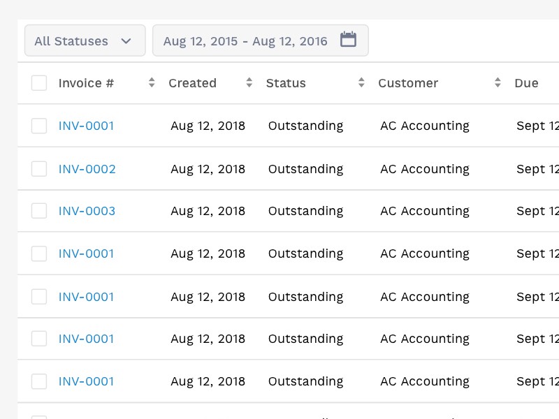
Source: uxdesign.cc
Advanced filtering assign filtering parameters to certain columns.
Source: uxdesign.cc
Or both of them to be on the safe side.
It allows users to effectively work with data in the table, sort rows in alphabetical order, or even specify filtering parameters.
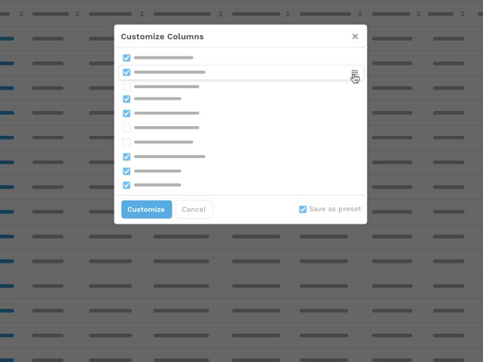
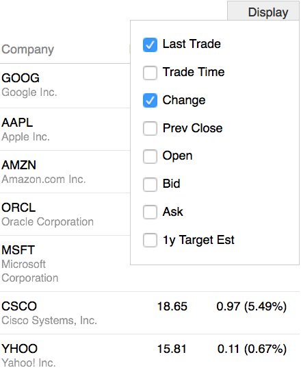
#9 Add column customization
A great feature to free the hands of the users is to design tables with customizable columns. It allows changing the columns of the table and choosing only those required for a particular task. It is also helpful to include the possibility to save presets for the future.
Source: uxdesign.cc
It is only a few recommendations you can apply to improve your data table UI and UX.
So, when working on your next table design, keep in mind that presenting data clearly is not enough.
You need to help users effortlessly analyze the information so that the data can be turned into action faster.
Things get more advanced when working with mobile tables.
How to design mobile tables
Before you start your mobile table design, ask yourself just one question.
It is, whether users are going to compare or not compare data in the table? The answer is crucial as it will influence further actions.
If the answer is NO (meaning users won’t compare the data in the table), then you can linearize a simple table into a list and use an accordion view, if necessary.
As a rule, lack of space on mobile screen forces designers to turn tables into a list. Here is an example of how I managed to turn huge web table into list for mobile.
Table for desktop version of the web page
The same table designed for mobile device
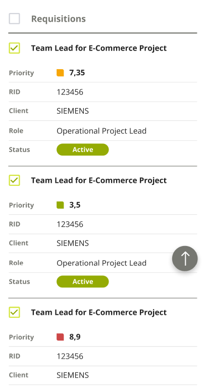
You can also use accordion to present the details in the expandable area and not clutter the table.
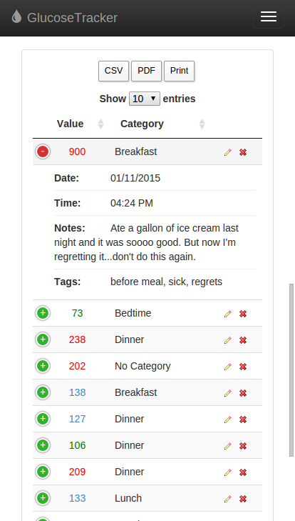
glucosetracker.net
If users of the table compare data in rows and columns, then you should pay extra attention to such types of table.
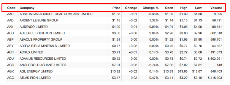
One of the solutions when the user is likely to compare rows is flipping the table.
Below is an example of the solution. The table flips so that the header row is a header column and the rows are now columns that are scrollable.
Table with a header row
 The same table with a header column
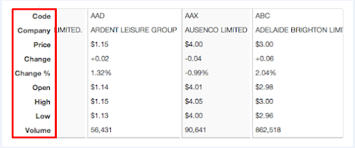
It’s better to have a readable table that requires scrolling than a table you don’t scroll but can’t read.
When ability to compare columns is critical, you can hide non-essential fields and provide the possibility to turn them back on.
This solution can turn a data-rich table designed for a large screen into small and readable table just like the example below.
Table designed for a large screen
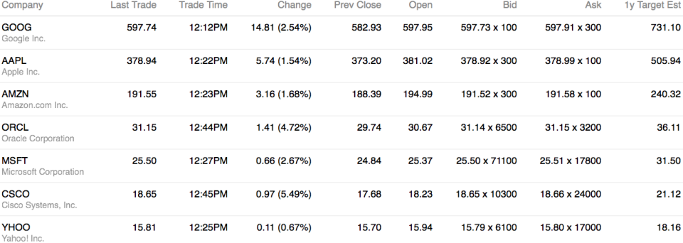
Source: alistapart.com
The same table with an ability to add columns which are essential for a user
Source: alistapart.com
To make the table more user-friendly you should use only important data and reduce the rest.
There’s no need to insert all available data into one table in order to cover all life situations. Sometimes, a few columns and rows that cover 2–3 tasks can work even better.
If you are like me and want to show fewer columns on small screens, answer the simple question “Which columns are the most important for the table to perform its main function?”
Conclusion
Here is also a simple checklist you can use to be on the safe side about mobile tables:
- Do people understand the meaning of the table in all contexts?
- Can people get to all the information?
- Have you made sure that every URL is accessible regardless of device?
If you can answer yes to all three, then you’ve done your job!
The next time you work on a data table, keep these tips in mind. They will help you turn the data set into something truly readable, convenient and insightful.
And if you have any questions or need some help with design or development for your software project, feel free to drop me a line.